Good design makes a successful connection with the audience, solves problems, and can be immediately and intuitively understood. Trends are an attempt to find new ways of achieving this goal, but they won’t all be successful, and they won’t all be right for your brand.
Worse, digital design is a creative field that rewards innovative thinking and cutting edge ideas, but following trends runs the risk that your design won’t stand out from any of your competitors! But that doesn’t mean you should ignore trends; it’s important to evaluate them and make sure they fit your brand before you adopt any.
Why should you follow trends?
Digital marketers operate in a space where we have a few vital seconds to convince a user that our website is one worthy of their attention. One of the ways we can do this is by using strong visual cues, and one of those cues is relevance. Adopting a design trend that has become popular can suggest to users that a brand is current and relevant, which can be especially important in users’ quick decision-making processes.
We also pay attention to conventions which are becoming firmly established. As trends become conventions, users become accustomed to using these design shorthands to find information and navigate websites.
It’s also vital to keep websites looking refreshed and updated, and new trends can help refresh old designs. Dated design is associated with old technologies, old practices, and a bad experience for users. It’s enough to put many off in a heartbeat!
That’s why it’s so important for us to follow digital marketing trends and suggest any relevant and appropriate ones to our clients. Here are a few of the latest trends that have made an appearance in 2019 that we’ve used for our clients.
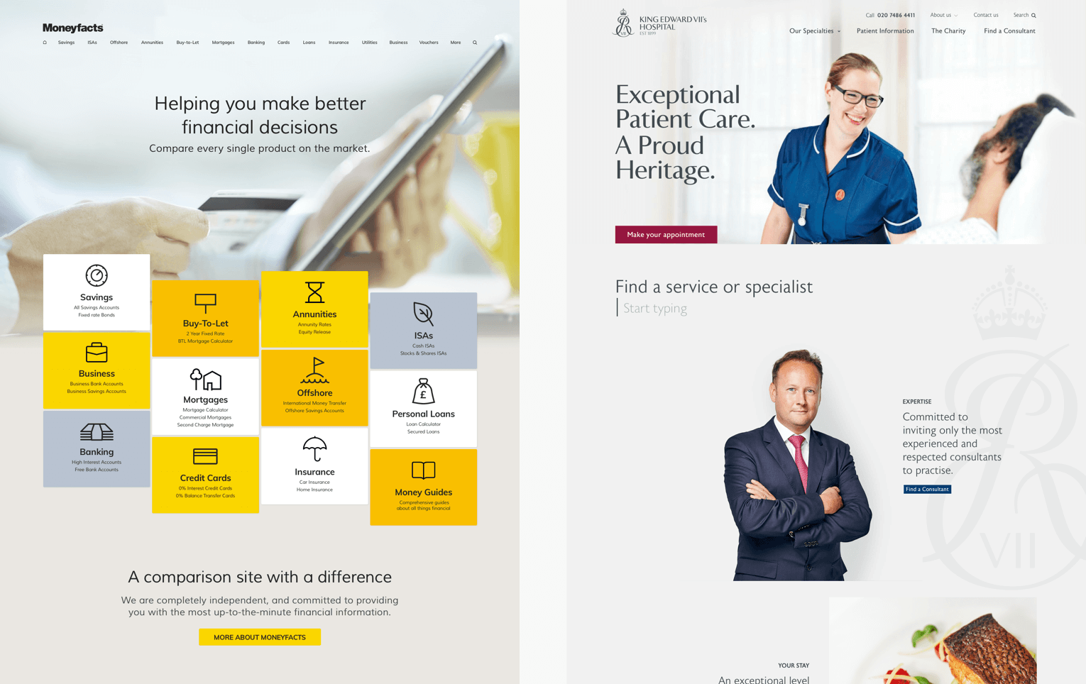
Hero videos and images
With connection speed becoming less and less of a restriction, full-screen video headers are becoming a much more viable option. They create an immersive and engaging visual experience, effectively setting a scene or telling a story.
Before recommending full-screen video, we consider the audience, as well as the device and the connection the majority of them are likely to have. Whilst the ideal scenario is for the video to be shot for purpose, there are other options such as using stock libraries or editing existing video. As ever, we work with our clients to find the right solution for their project.
Proving that not every trend is as popular as the buzz makes it sound, we’re still finding most of our clients prefer a large image in the header, rather than video. The image still creates a strong first impression, but it also allows the user to explore the content without having to wait for a video to load.
Illustration
Our own website is full of bespoke illustration work, all created in-house by our design team. The benefit of using illustration is that it creates a distinctive style you can really own.
But although illustration means your website will stand out (and help you avoid generic stock photos), we found having an illustration-led site can be quite a commitment of time and effort if you intend to use it as liberally as we do! Before we suggest illustration to our clients, we look at current and future requirements, and make sure that their needs will be met.
Geometric patterns and sharp angles
This trend is a natural progression of the bands of colour used to break up long scrolling pages and single page sites. In fact, the Internet has become a little over saturated with horizontal stripes, and now angled stripes are on the rise too!
But, although this is a perfect example of a trend that might become overused, that doesn’t mean you should dismiss it immediately. On balance, we recently decided that similar design elements were appropriate for two of our clients.
The first was because we were interpreting a branding agency’s vision for a client for online use, and angled lines were one of the devices they had created. The other was for a client who had a very angular logo; in their case, the angled lines really complimented the brand.
Large bold experimental type
Online typography has always had a lot of restrictions in comparison with print media but, as technology evolves, we’re starting to see an emergence of on-screen experimentation.
Large, beautifully designed words can be just as impactful as an image, and they can be just as unique to a brand as illustration. We proposed some exciting concepts to a local art and design establishment, which also included animation for some extra punch!
Brutalist layout
Whilst brutalism originated as an architectural movement in the 1950s, in digital terms it is a reaction against perfection. It defies rigid, grid-based layouts, uses oversized ‘ugly’ elements and pretty much does what it likes.
Of course, we understand that brutalism won’t be the direction of choice for many of our commercial clients, but that’s not to say that a little nod to it doesn’t make for slightly more individual layouts which are still perfectly usable and unscary!
Inspiration, not instruction
It’s worth following the latest trends in design, but only for inspiration. Use the design elements that work for you, but don’t be afraid to ignore the trend if it isn’t right for you. And if you have any questions about web design, get in touch; we’re always ready to answer your questions!