
One of the best ways to demonstrate expertise and authority is with a carefully crafted content strategy. Once we knew what the content would look like, we could start designing the site.
Content
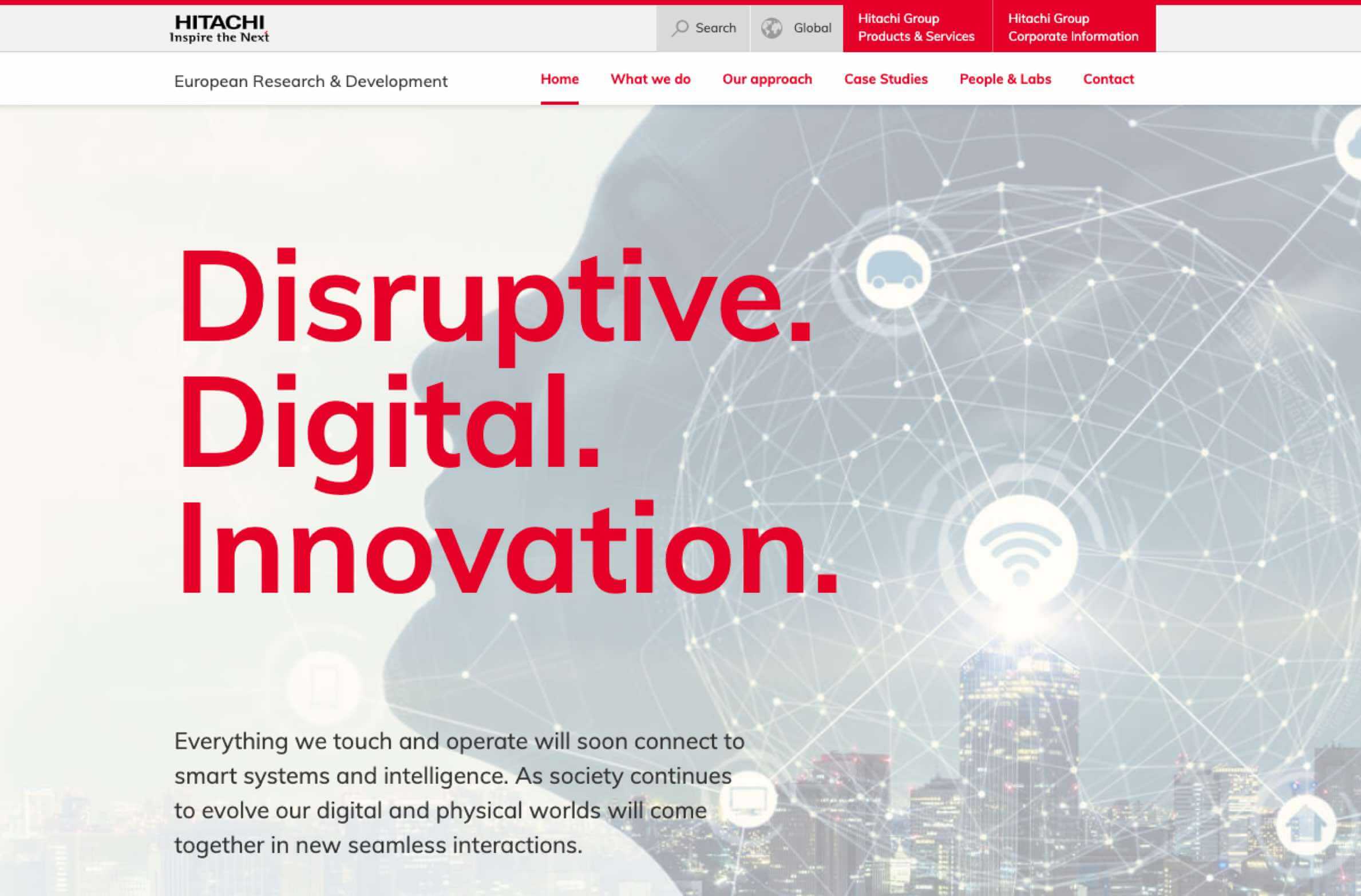
Hitachi is known across the globe for its technological innovation, but the story behind those innovations often hinge on technical detail. As such, a lot of the information Hitachi supplied to us was full of detailed research and science.
This would have posed no problem if the website was intended to target technical professionals. But the site needed to target figures in management and director positions.
This meant that too much data and detail wasn’t appropriate, so we distilled the complex information Hitachi had supplied into content that was easy to understand for the target audience and encouraged them to choose to work with Hitachi.
Platform decisions
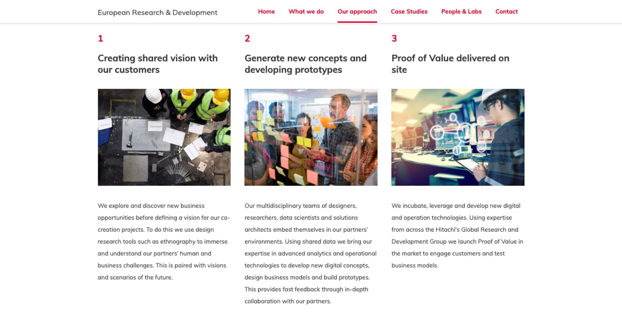
With our content in place, we turned our attention to the design and build itself. Hitachi’s platform of choice tended to be Drupal, but it’s important to choose the right platform for each project.
This website needed to be a content-driven brochure site, so we felt that a lighter, more flexible platform might be more suitable. Wordpress seemed like a good choice, and had the added benefit of being easy for the client to maintain themselves should they want to.
Being an innovative research firm, Hitachi wanted to push the boundaries of brand guidelines. We worked closely with them to maintain that innovative spirit, but it was also important to retain some ‘traditions’. Users are used to seeing some elements on every website, such as the logo linking to the homepage, so we were keen to strike a balance between new ideas and existing standards.
User testing
Hitachi was pleased with what we had built, but the best judge is the person using the website. That’s why we agreed with Hitachi that we would conduct user testing, taking a number of people who have never seen the site and asking them to perform a number of tasks, as well as gather their individual feedback and impressions.
User testing is something that we’ve done for other clients, but our Hitachi session ended with the most positive results we have ever received!
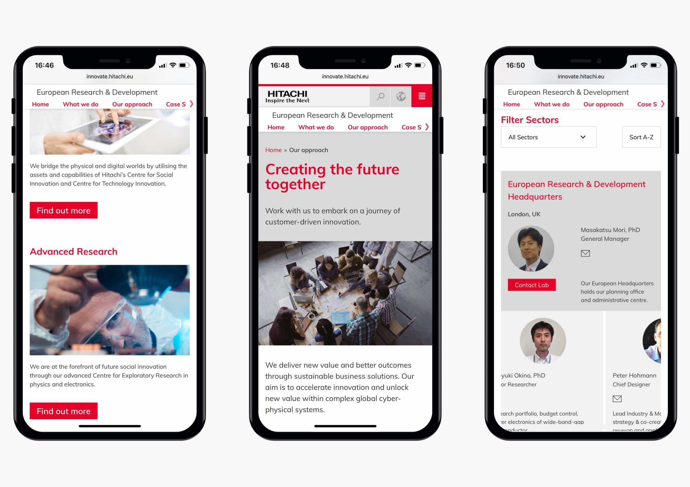
One area was highlighted as needing improvement, as it wasn’t quite clear to all of our users how to find a case study for Big Data Analytics. This led us to implement a new filter option to make this task clear and straightforward.
And while many websites struggle when it comes to mobile usability, we were pleased to find that the group using mobile devices reported an even higher satisfaction score than the desktop group, awarding the website an 86/100 mobile usability score and a 4.8 average ease of use score.
Finally, the members of our test group all reported that the site was informative, eye-catching, and conveyed an air of confidence and innovation; exactly what Hitachi was looking for in their new website.